

Closing the gap
between design
and delivery.
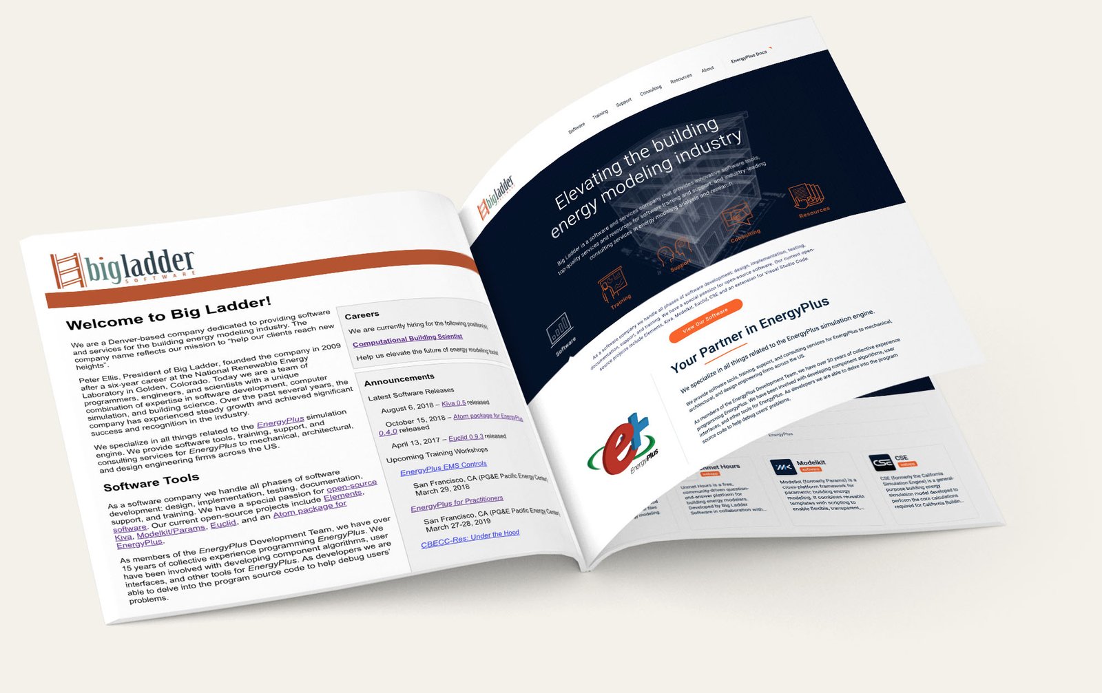
...so did my role.

The short version.
I identified the problem, researched the people using the website, restructured the experience, designed the system, communicated the direction, and carried the work into production.

My Role
UX strategy, research, UI design and then front-end production

The Work
Company website, content structure, design system and publishing tools

What Shipped
A responsive website and a maintainable foundation for future work
Something
wasn't
working.
Big Ladder had grown into a respected company with valuable software, deep technical knowledge, established training, and years of project experience.
Its website had not grown with it.
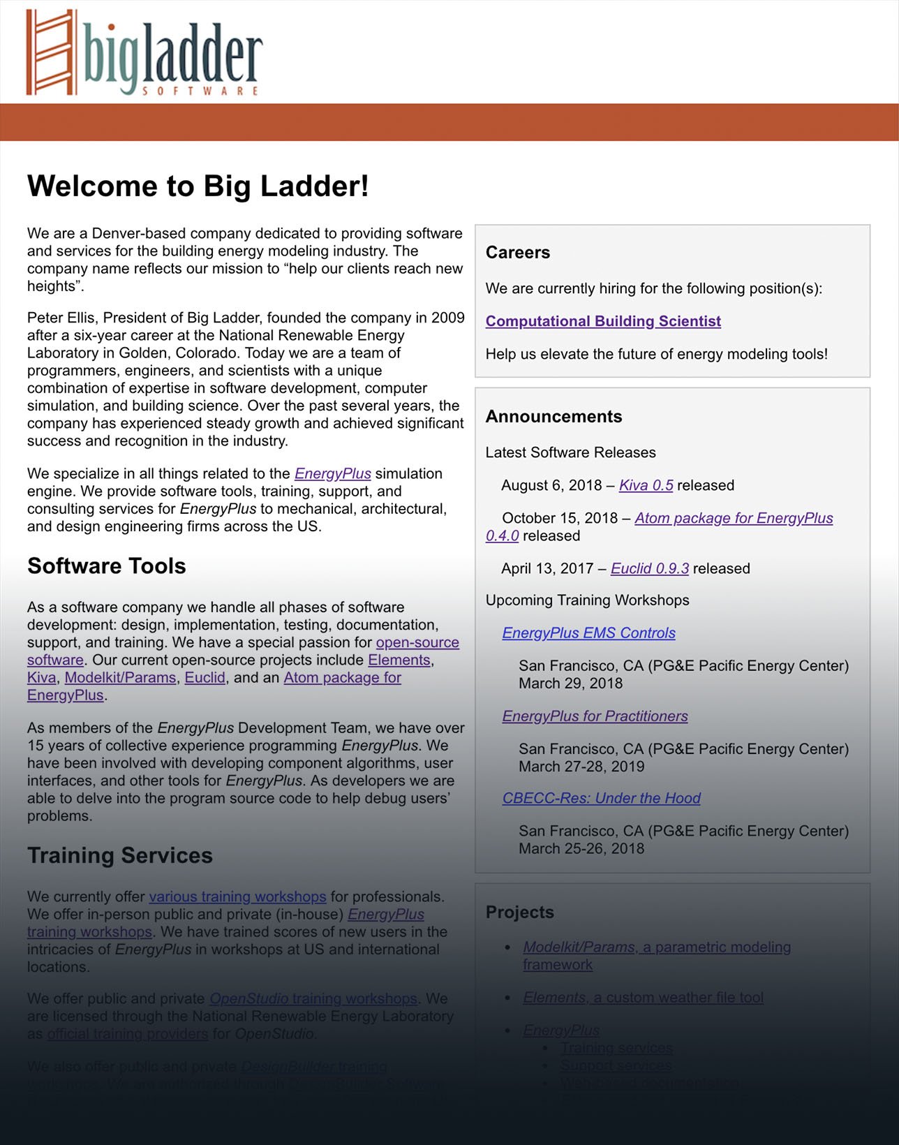
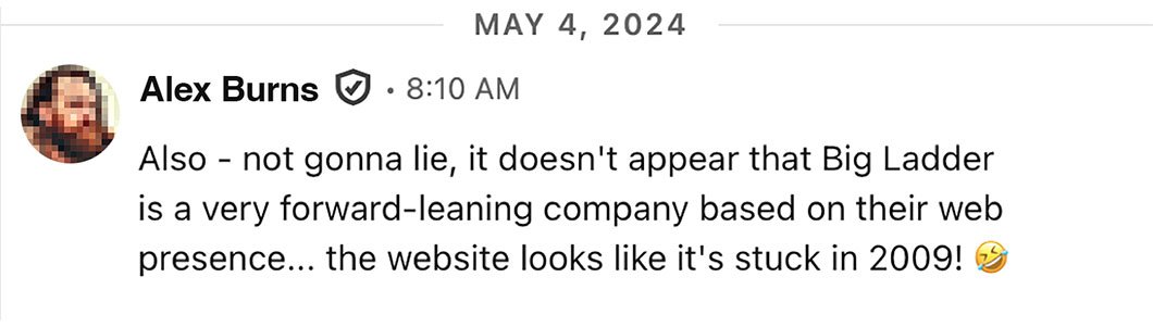 Fair.
Before deciding what the website should look like, I needed to understand what people actually came there to do.
The answers varied. The patterns didn't.
What I kept hearing
"I can't find the latest version!"
Users wanted quicker access to current software, documentation and the resources they used repeatedly. For experienced users, the website was often a utility, they knew exactly what they wanted and didn't want to hunt for it.
"No, we don't sell ladders!"
A line from Big Ladder's president, after years of fielding calls from people looking for actual ladders. Funny, yes, but it pointed to a real problem. Someone encountering the company for the first time could struggle to understand what Big Ladder did, who it worked with, and why its expertise mattered.
"Can I see work you've done?"
Prospective clients wanted evidence that Big Ladder had relevant experience before starting a conversation. Prospective hires were looking for something similar: the kind of problems the company worked on, the organizations it worked with, and the impact they could potentially be part of.
"You mention training. Where is it?"
Training was an established part of Big Ladder's work, but discovering the available courses, understanding what was relevant, and knowing where to register required more effort than it should have.
"How do I find anything?"
There was no clear navigation system connecting the growing collection of software, documentation, training, projects and company information. The content existed, but the website offered very little help in understanding how it all fitted together.
"I don't even know who to contact."
For someone considering a project, asking a technical question, or exploring a job, reaching the right person shouldn't be the difficult part. Yet users weren't always sure who to contact or where to begin, creating unnecessary friction at a crucial moment, when someone was actively trying to engage with the company.
Not everyone came for the same thing
The patterns were clear,
but they weren't coming
from the same people.
Someone looking for the latest software had very different expectations from someone encountering Big Ladder for the first time. A prospective client needed proof. A potential hire wanted to understand the work and the people behind it. Experienced users knew exactly what they needed and wanted the shortest route there.
Different people.
Different needs.
Trying to design for an average of all of them would have served none of them particularly well.
Three clear user archetypes emerged from the research.



Personas gave those different needs a seat at the table. When decisions were being made, we weren't designing for an abstract "user" anymore. Steve, Hope, Will gave us someone to bring back into the conversation: Who is this for? What are they trying to do? Does this decision actually help them?
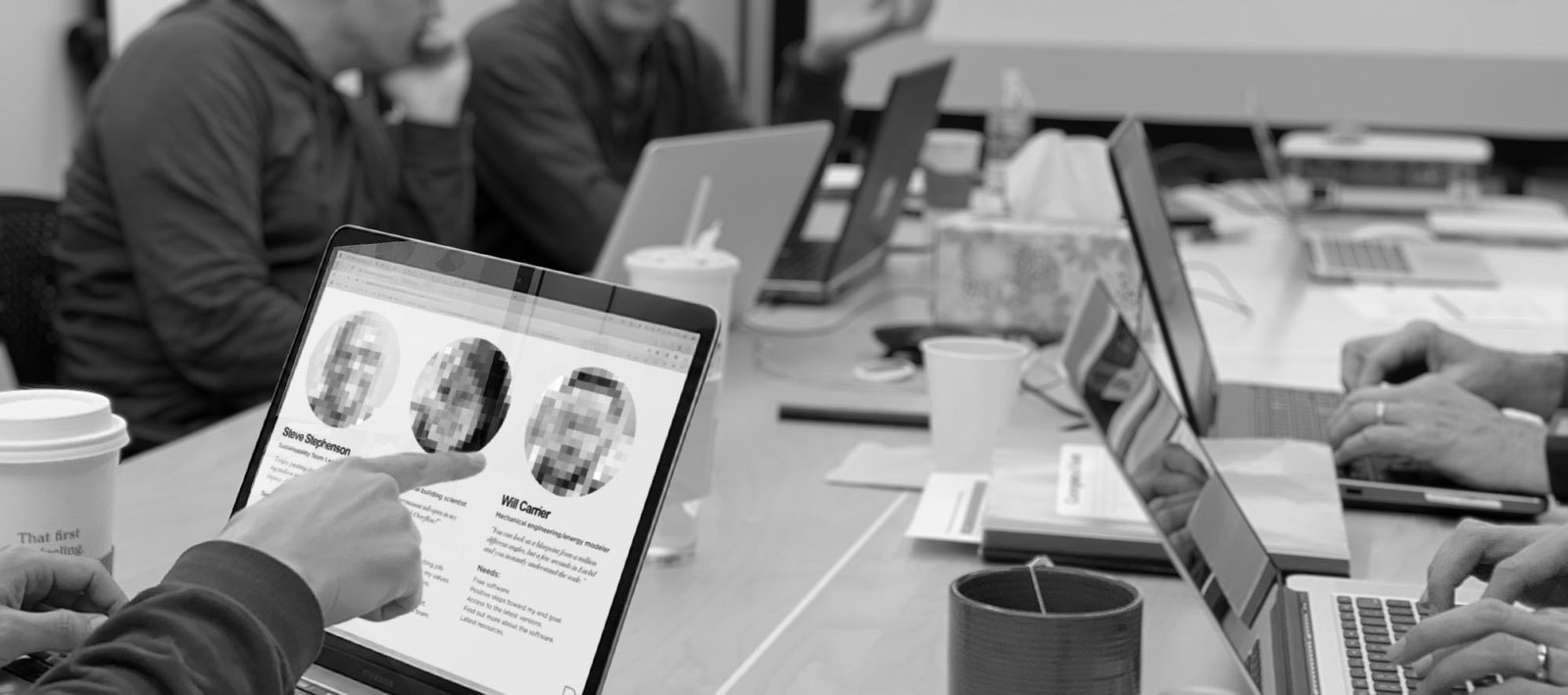
But making the user present when decisions are being made?
That part still matters.
The numb3rs had
something to say too

Interviews told me what people wanted.
Analytics showed me how
they were actually getting there.
And a lot of them weren't coming through the front door.
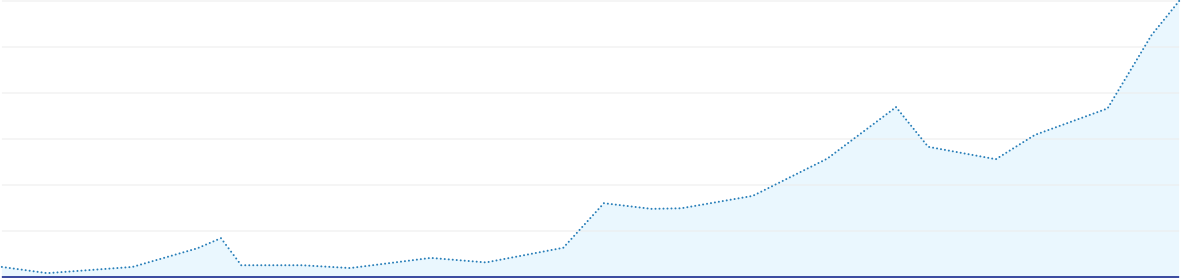
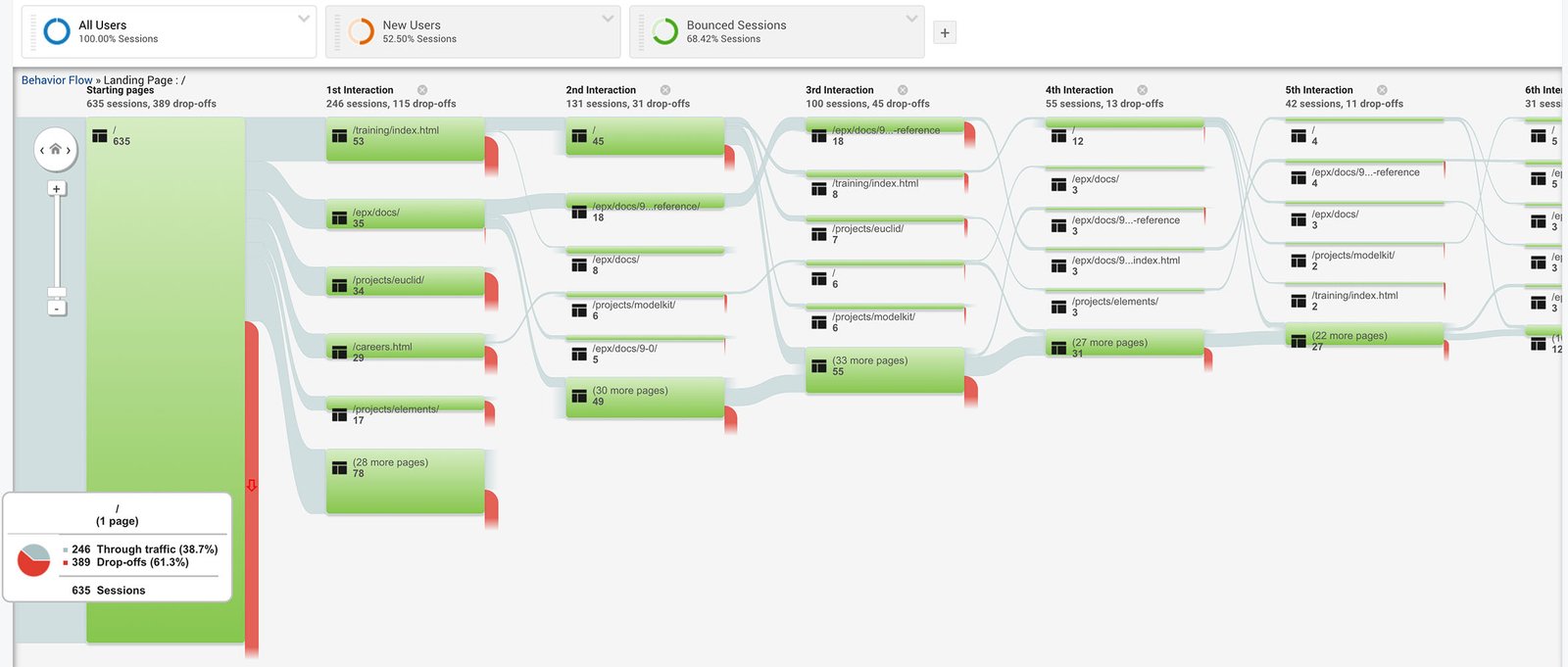
Technical documentation and project pages were major entry points. Visitors arrived from around the world through search results, saved links and external references, often landing deep inside the website without ever seeing the homepage.

That changed how I thought about the experience
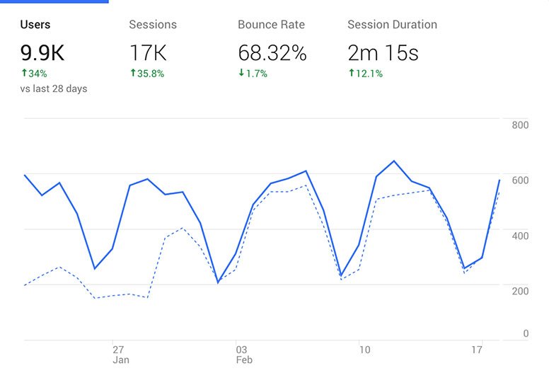
Important pages needed to orient people, connect them to the wider site, and make the next useful step obvious. A 28-day snapshot showed roughly 9,900 users across 17,000 sessions, with visitors arriving from around the world and desktop accounting for just over 82% of sessions.
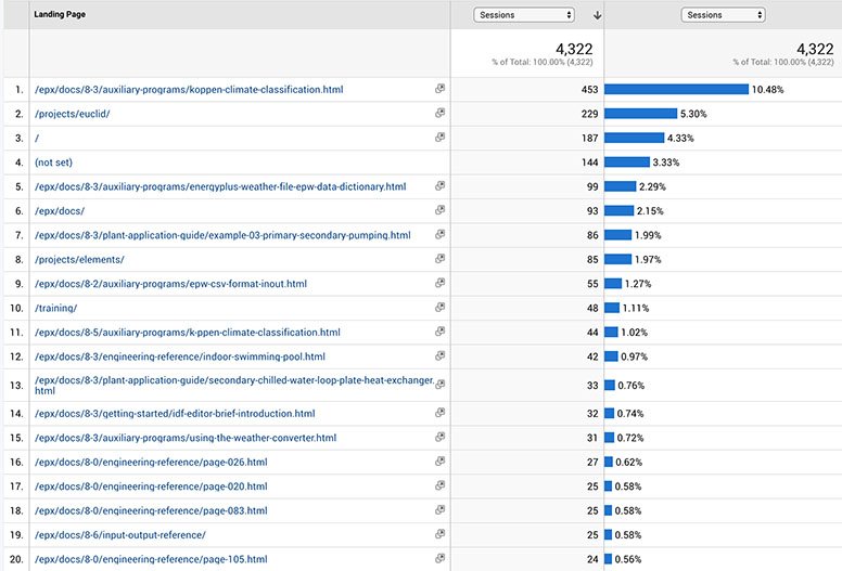
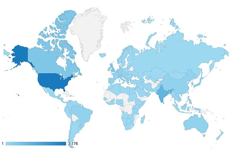
But the more important finding was where those journeys began:
documentation, projects and other pages were often the front door, not somewhere people reached from the homepage.
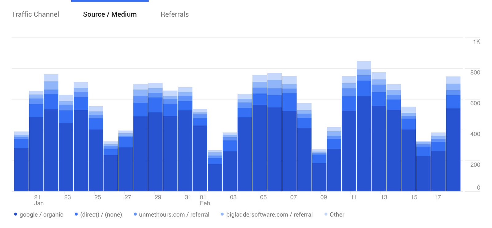
The data also reinforced some of what I had heard in the interviews.
- Software and documentation needed faster routes.
- Training deserved greater prominence.
- Existing URLs mattered because people were already relying on them.
The website didn't need one perfect journey.
It needed to work wherever someone entered it.
By now, the problem wasn't a lack of information.
It was deciding what mattered,
who it mattered to, and how it should
all fit together
I grouped what I had learned, looked for repeated needs, studied comparable websites, mapped content, and tested different ways of structuring and describing the company. Some ideas survived; others made perfect sense until they were put in front of someone else. The structure had to serve both sides: someone arriving for the first time needed to understand what Big Ladder did, why its expertise mattered, what it had worked on, and where to go next, while someone who already knew the company needed none of that.
They needed the shortest route to what they came for.
That tension shaped the structure
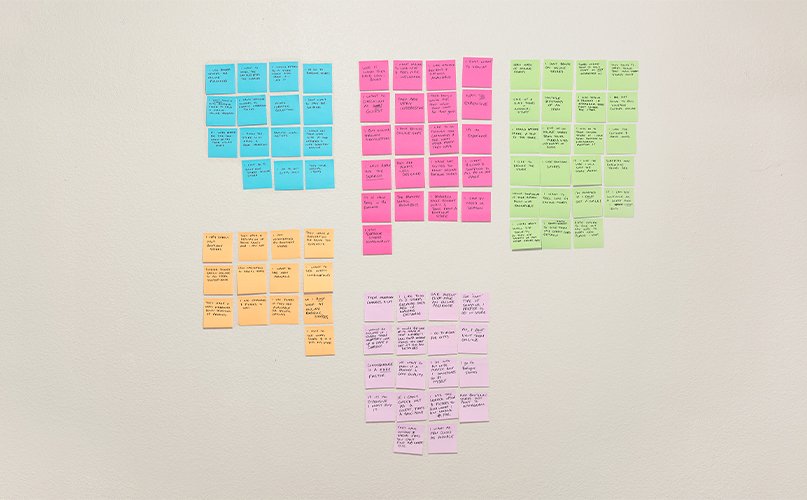
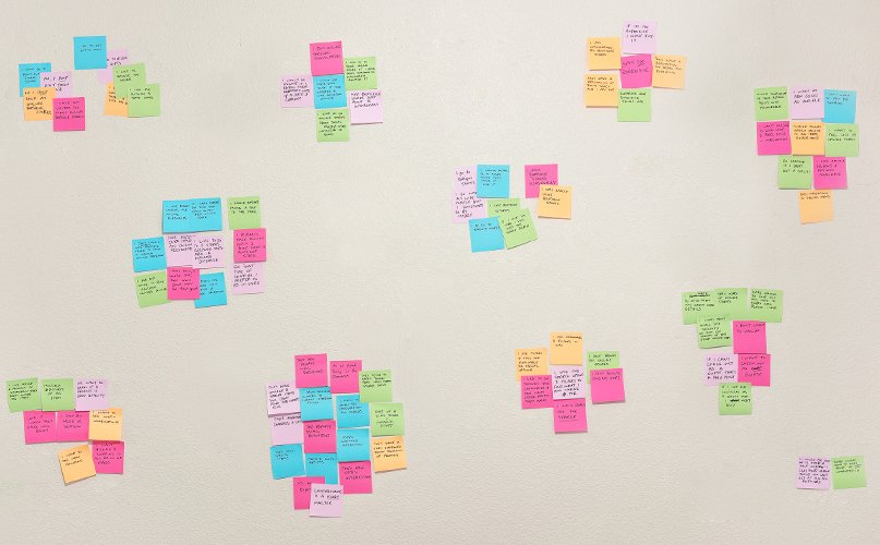
BY PERSON

BY PATTERN
BY STRUCTURE
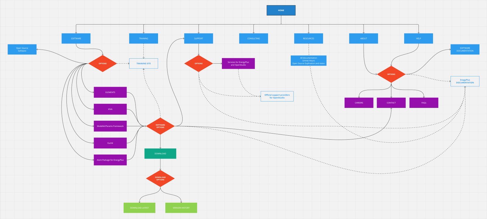
Research stopped being something I had collected.
It became something I could design with.
Making it visible.
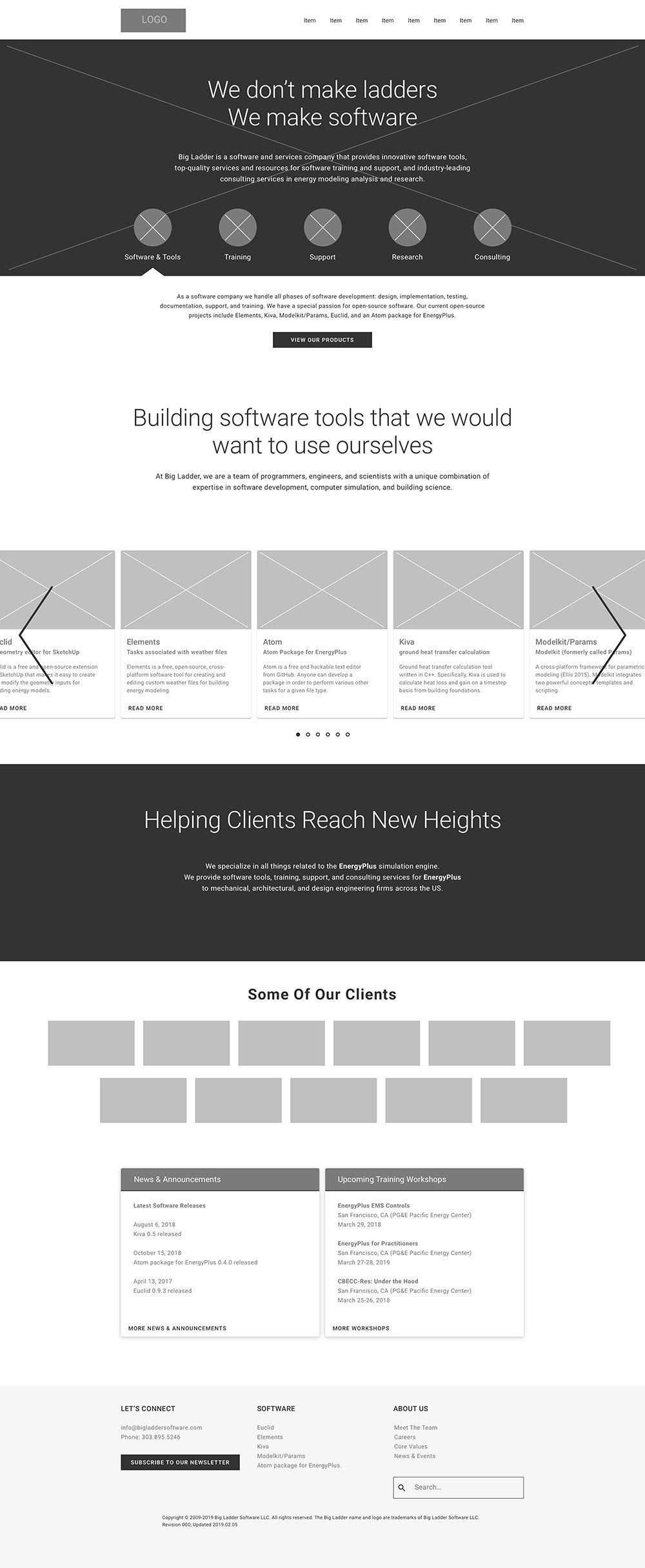
The structure was becoming clearer. Now the design needed to make that clarity visible.
I developed a visual system around typography, colour, imagery, hierarchy and reusable components, then worked through how that system behaved across pages, content types and screen sizes. The goal wasn't to make Big Ladder look bigger, louder or more impressive than it was.
It was to reflect the company behind it.
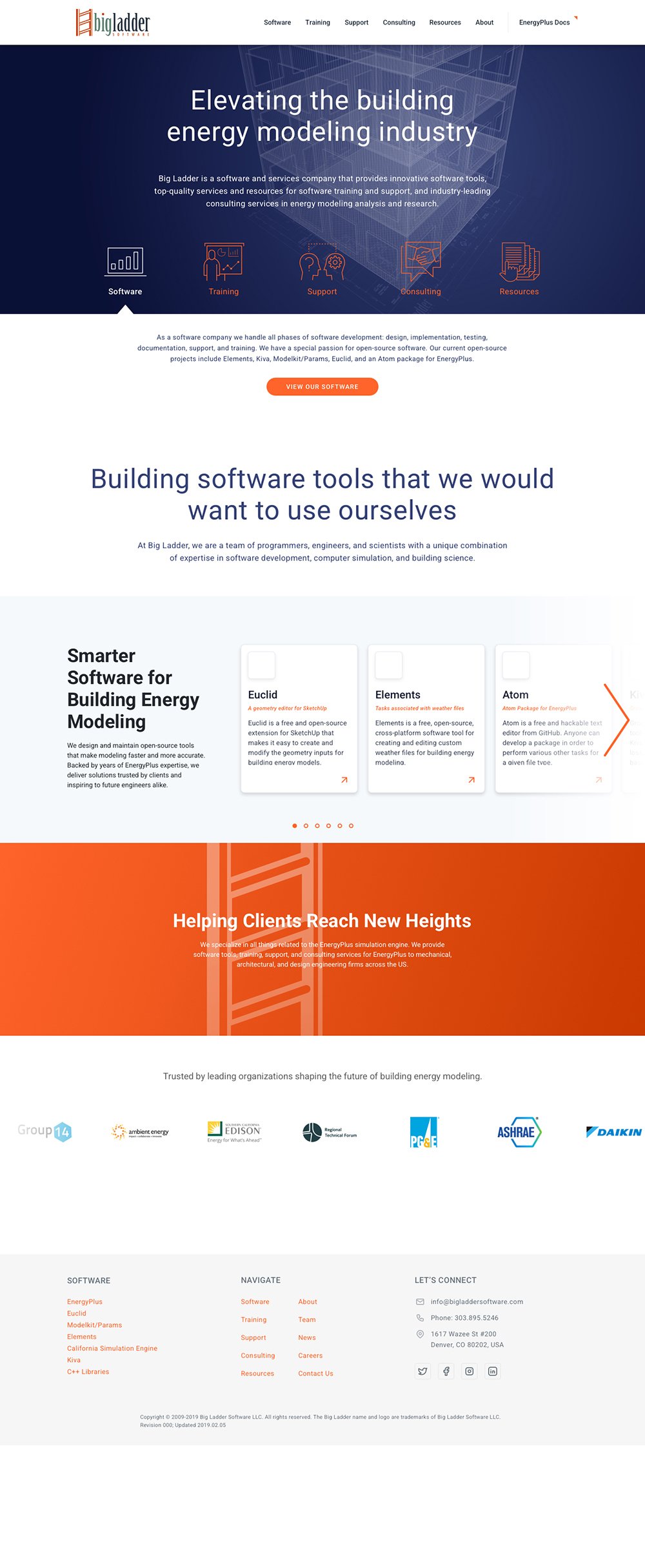
One system. Many jobs.
The website had to move comfortably between very different kinds of content: technical software and documentation, training, project work, company information, news and deeper editorial content. Rather than designing each page as a separate composition, I built a shared visual language flexible enough to give those different needs their own hierarchy without making them feel like different websites.
The system created consistency. The content decided what mattered.
Show early.
Show often.
I'd rather find out something isn't working while it's still easy to change. So I shared the work throughout the project, from early ideas and structure through to prototypes and finished designs. Sometimes feedback confirmed the direction, sometimes it exposed something I had missed, and sometimes perfectly reasonable needs pulled in opposite directions. My job wasn't to defend the design, but to understand what sat behind the objection, decide what genuinely needed to change, and make the work better.
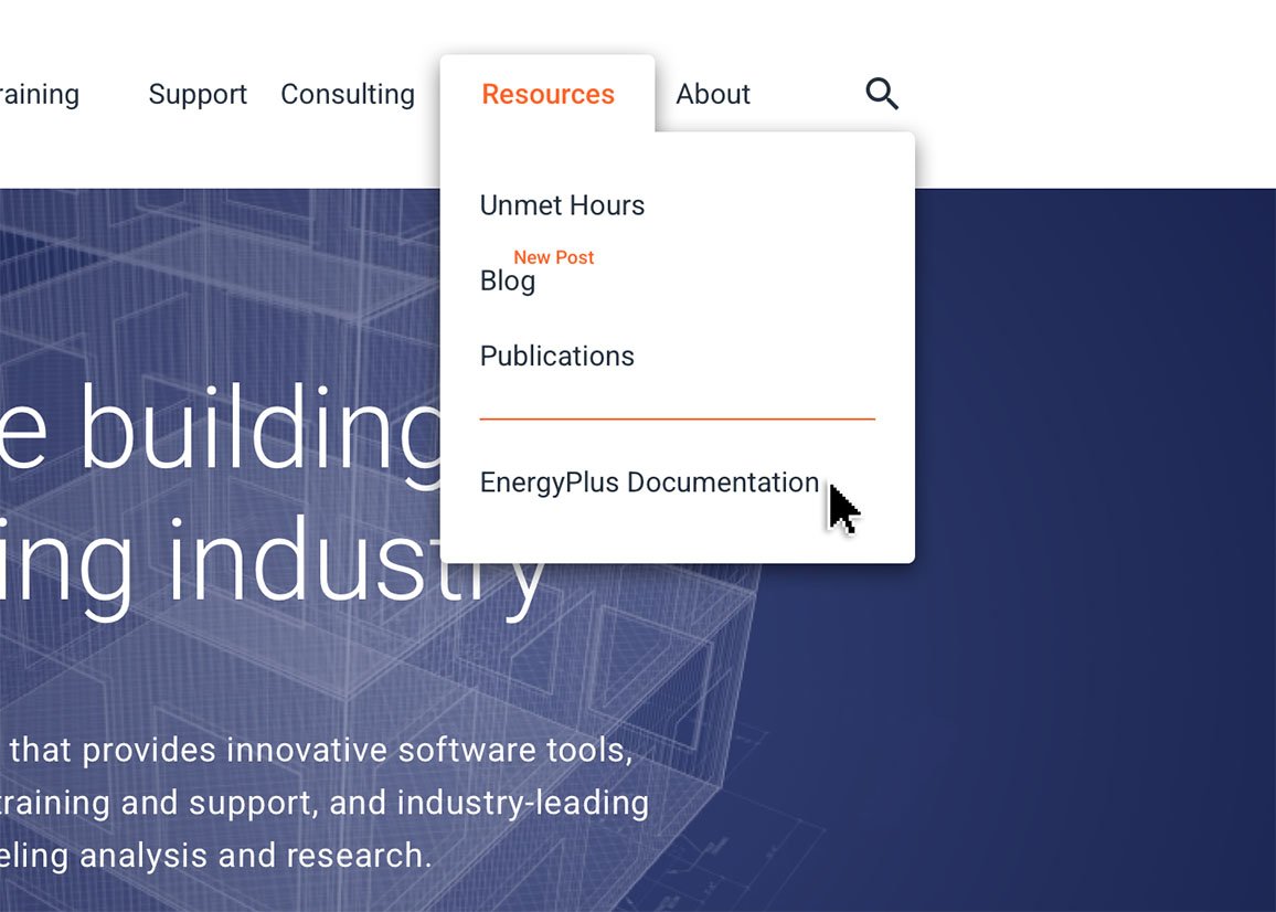 Early mockups had EnergyPlus included in the "Resources" menu
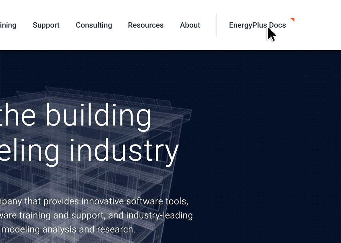 User feedback was that it was buried and could not be found
Not every idea survived. The work was better for it.
The designs were ready.
Delivery wasn't.
The website was designed, reviewed and ready to move forward. But development capacity was rightly focused on the work that kept the business moving: client projects and software. The website had to wait for the right people to have the right opening at the right time.
It was getting the design delivered.
So the process changed.
Waiting wasn't going to get the website built.
I already knew HTML and CSS, and had enough experience with JavaScript, PHP, Docker and development environments to understand what needed to happen, but not enough to do all of it alone. AI helped me close those gaps. I used it to explain unfamiliar territory, challenge approaches, translate interactions into code and diagnose problems when things inevitably broke.
What changed was how much of the distance between design and delivery I could cover myself.
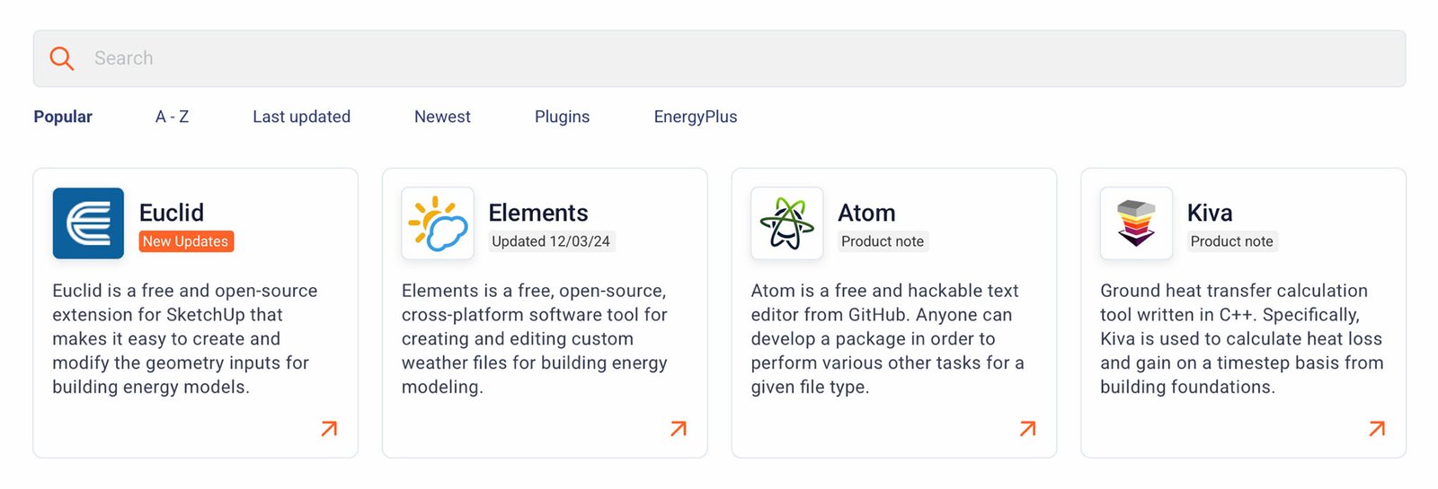
So I built it.

Building changed
the way I was designing.
The website was only part of it.
Once I started building, some of the design changed with it. Spacing, elevation, interactions and components were refined once I could see them working with real content in the browser. But the bigger change was happening behind the interface. I was making decisions about how content was structured, where it came from, how it was reused and how the people responsible for it would keep it up to date.
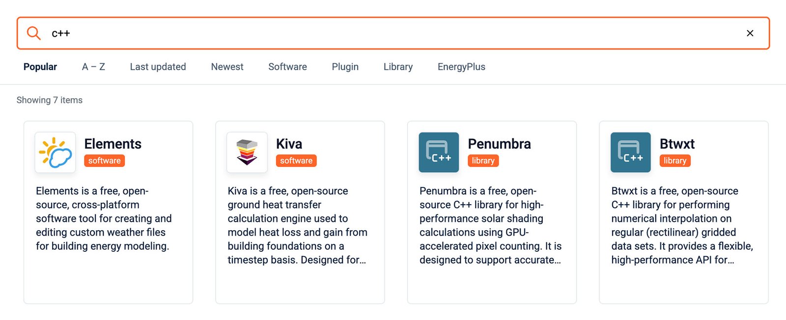
Software was a good example. Instead of maintaining the same information in multiple places, I created a single source of truth. One JSON file could feed the software catalogue, individual product pages and other places the same information appeared across the site. But a system is only useful if people can use it. So I also built an admin interface that allowed our power users to add, edit and publish that content without touching the code.
ADMIN MANAGER
Add, edit and publish content without touching the code.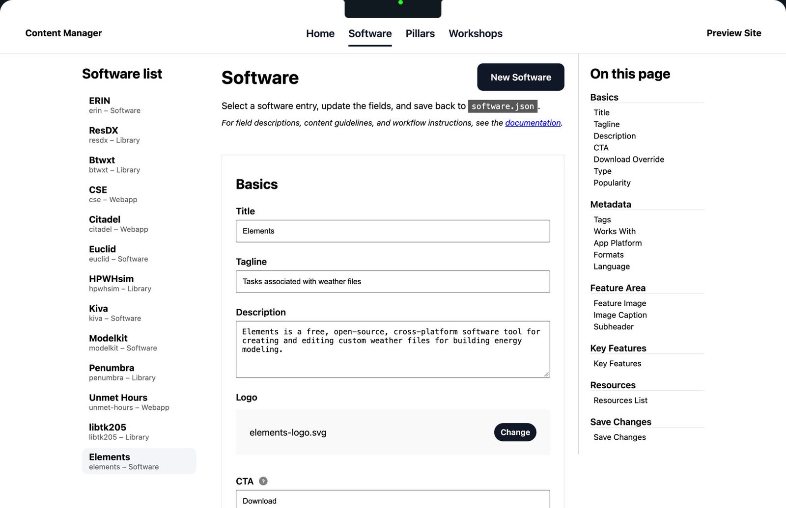
ONE SOURCE OF TRUTH
software.json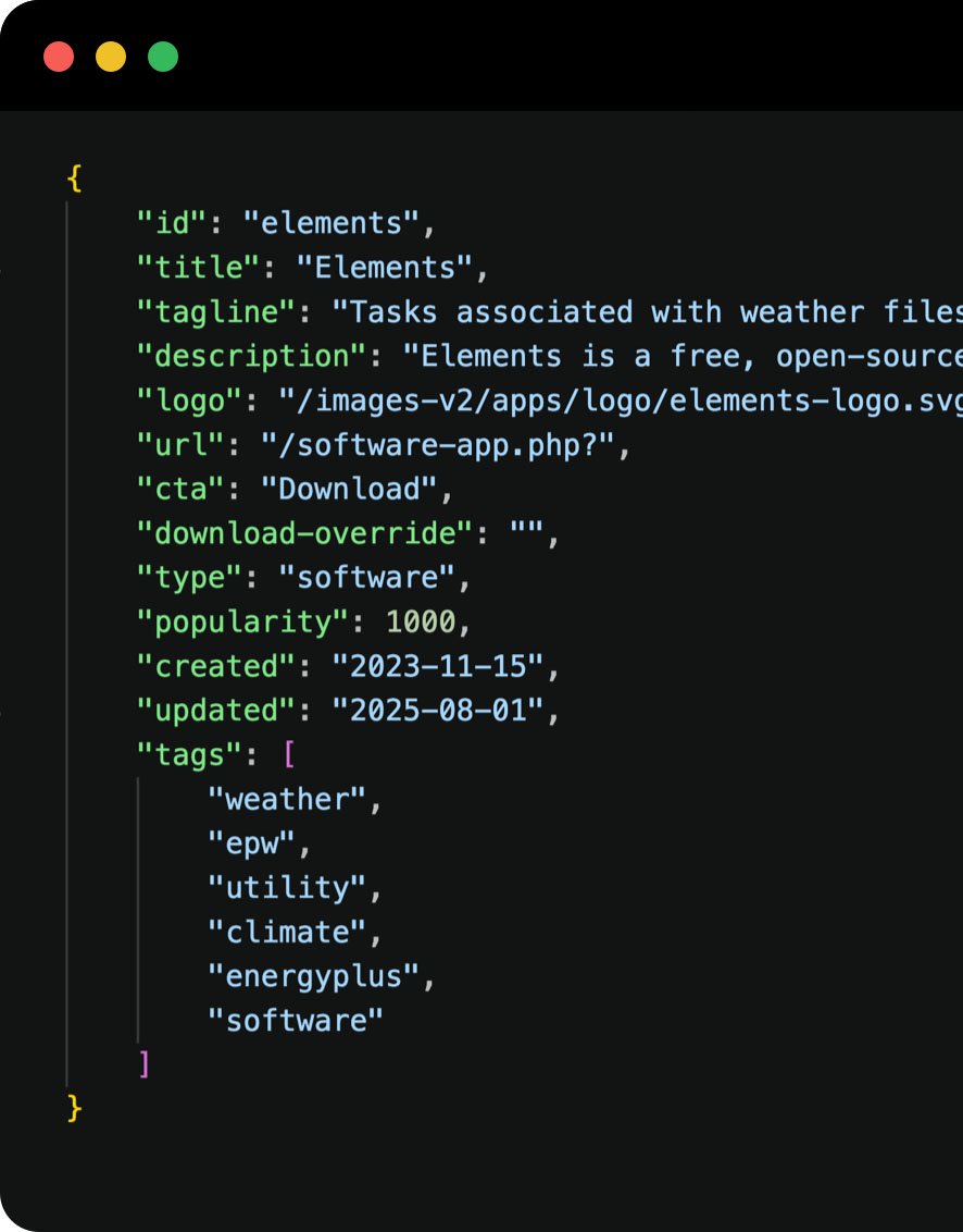
Edit once, publish everywhere.
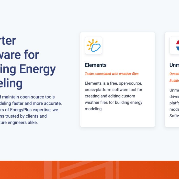
HOME PAGE
Software carousel.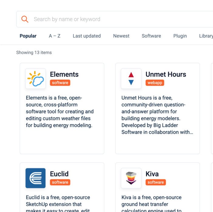
SOFTWARE LIST
Filterable catalogue.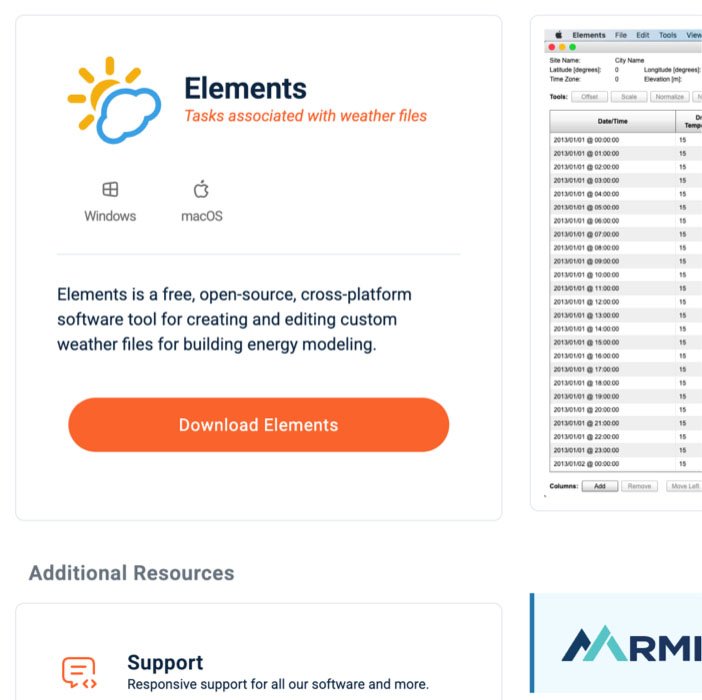
PRODUCT PAGE
Individual software pages.A solid, sustainable platform. One that could work without me.
Apparently it's unlucky.
A website that finally reflects
the company behind it.
The information was always there. The expertise was always there. The work was always there.
Now people could see it.
Big Ladder had a clearer way to explain what it did, show what it had worked on, connect people with its software, documentation and training, and give someone a way to reach the right person. But shipping the website solved another problem too. The reusable components, publishing tools and design-to-production workflow meant the site could keep changing without every improvement becoming another development project.
The website was no longer waiting. Neither was the design.
Cut to the chase.
I can say all the right UX things.
I interviewed users, created personas, studied analytics, explored competitors, mapped the structure, designed the experience, presented the work, listened, iterated and tested.
All the boxes are checked. NOw what?
The value wasn't following a process. It was knowing which question needed to be asked next, recognizing when something wasn't working, pivoting when needed, and finding a way to move the work forward.
What started as a website that didn't reflect the company behind it ended as one people could understand, use, improve and maintain.