

Complex problems.
Unexpected answers.
I thought less was more.
The engineers disagreed.
When you're designing complex software, simplification can feel like the obvious goal. Remove unnecessary controls, reduce the decisions on screen, guide people through a clearer sequence, and the experience should become easier to use. I've argued for that approach many times, and often for good reason. But working with engineering tools taught me that reducing what someone sees isn't necessarily the same as reducing the work they have to do. A screen that looks intimidating to a newcomer can be an efficient workspace for someone who knows exactly what they're looking at.
But it's not that simple.
The people using these applications aren't necessarily asking us to make the complexity disappear. They're trying to understand relationships, compare possibilities, check assumptions and make decisions they can defend. Hiding too much information, or spreading it across a sequence of carefully simplified screens, can make that harder. The challenge is to distinguish between complexity that belongs to the problem and friction we've introduced through the interface. One deserves respect. The other deserves redesign.
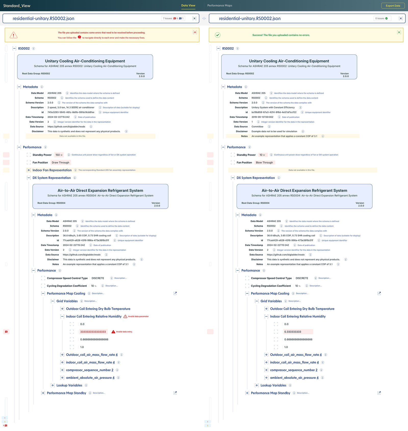
Instead of manually opening and comparing raw JSON or YAML files, engineers could view multiple standards side by side in a readable interface, identify errors, validate data and make changes in place. Less manual work, without sacrificing the detail they needed.
The lesson
Don't confuse fewer things on screen with less work for the user.
The best workflow isn't always
the one I'd choose.
One of the most useful things about working with engineers is seeing how differently they approach a problem. A designer might see a spreadsheet as something to replace with a cleaner interface. An engineer might see it as a flexible workspace where information can be scanned, compared, manipulated and checked without constantly changing context. In projects involving technical modeling and analysis, I've had to look beyond whether an interface felt polished and ask whether it supported the habits and decisions that made its users effective.
What changed my thinking.
Research isn't just about asking people what they want from a new design. It's about understanding what their existing tools let them do, including the awkward-looking workarounds that turn out to be essential. A familiar table, an exposed calculation or an unconventional sequence of steps may carry years of practical knowledge. That doesn't mean every established workflow should be preserved. It means I need to understand why it exists before deciding how to improve it. The best opportunities often appear when you stop trying to teach users your preferred way of working and start learning theirs.
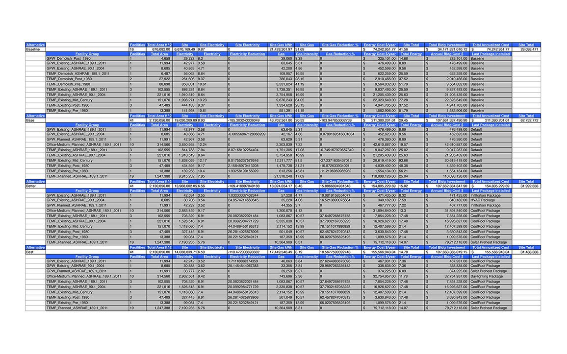
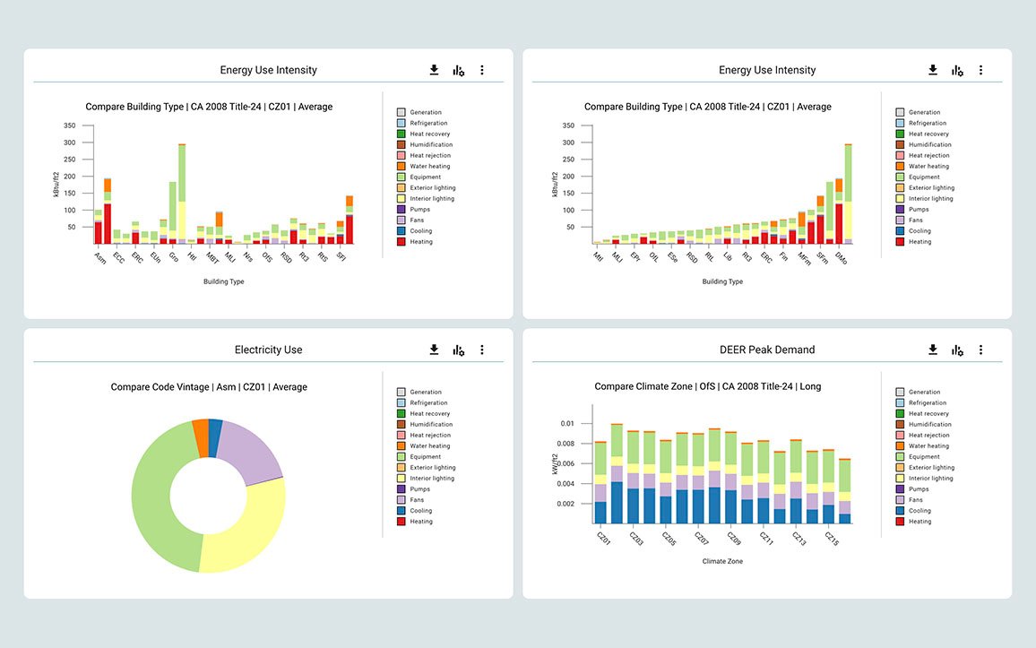
Engineers had their own way of organizing and working with data. Rather than replace those familiar spreadsheets, we added visualizations that helped them turn complex findings into something their clients could understand.
The lesson
Design for the work people actually do, not the workflow you wish they had.
Do the heavy lifting.
Leave the steering wheel.
Complex software shouldn't mean complicated experiences. Years of working with data-heavy applications have reinforced something I've always advocated for: the software should do more of the work. An application can use location and remembered preferences to suggest relevant climate and weather data, presenting useful metrics instead of an empty screen. A meaningful starting point, not another configuration exercise. AI offers an opportunity to take this further, anticipating what users might need without making decisions for them.
But here's the catch.
Engineers like getting under the hood. They want to question the numbers, challenge assumptions, explore alternatives, and sometimes throw out the defaults entirely. And they should be able to. Intelligent defaults are only useful when the information is trustworthy, the assumptions are transparent, and users have the freedom to customize, investigate, and access the raw data. The goal isn't to hide complexity, but to make it approachable without sacrificing control.
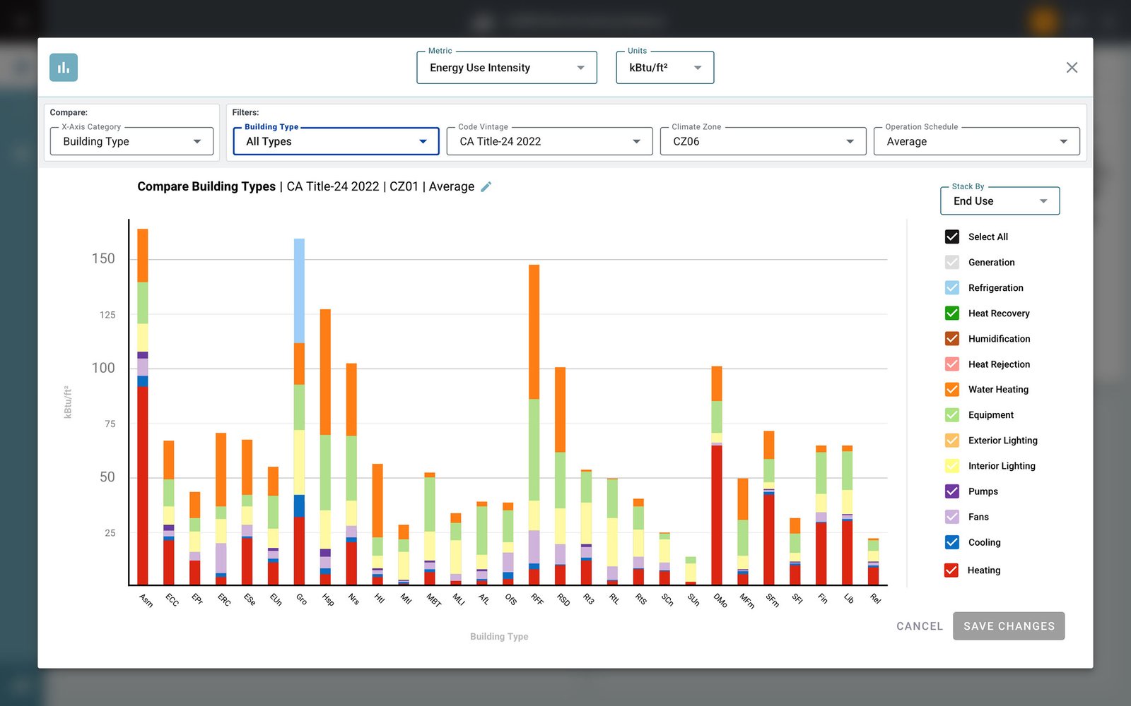
Location-aware defaults and remembered preferences take care of the initial setup. From there, engineers can explore, compare and customize the data as deeply as they need.
The lesson
Make the starting point effortless.Make the possibilities endless.
A good idea can still be
the wrong answer.
I've gone into projects with a strong idea of what needed to change, only to discover that the real problem was somewhere else. That's especially easy to do when the interface is visibly struggling: inconsistent screens, difficult navigation or a workflow that seems to take too many steps. Those things may need attention, but they can also be symptoms of deeper disagreements about what the product is supposed to do, who it's serving or how different teams understand the work. Sometimes the most valuable design decision is to stop refining the solution and revisit the question.
The uncomfortable part.
Letting go of an idea you've invested in isn't particularly satisfying. It can mean changing the scope, questioning a brief, or admitting that the direction you were confident about doesn't survive contact with the people using the product. But defending a design because it took time to create is a poor reason to keep it. I've learned to treat those moments as useful evidence rather than setbacks. The work gets better when feedback is allowed to change the direction, not just the details.
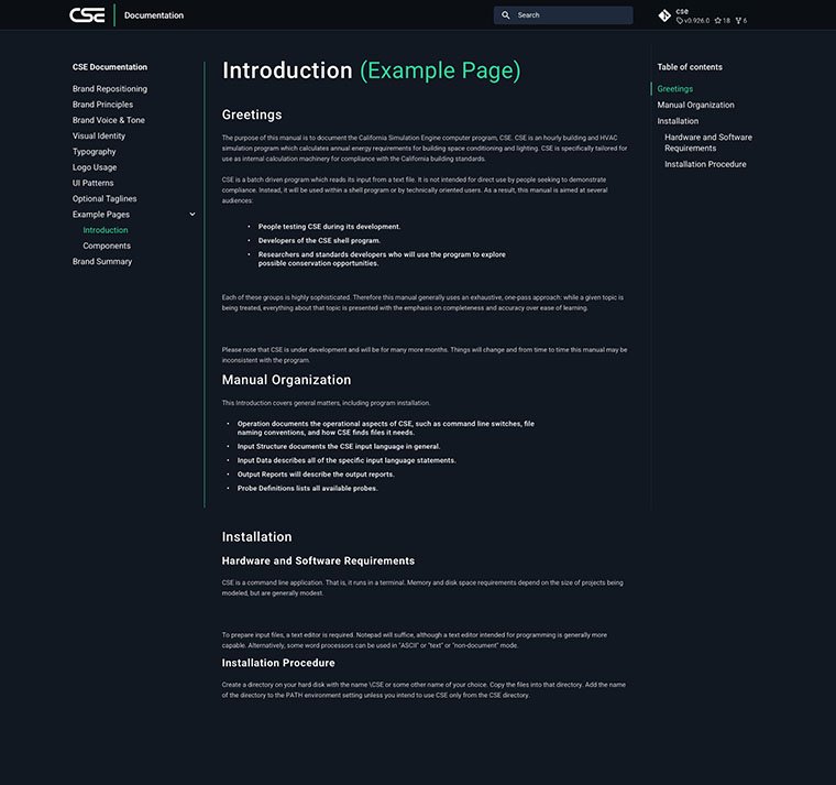
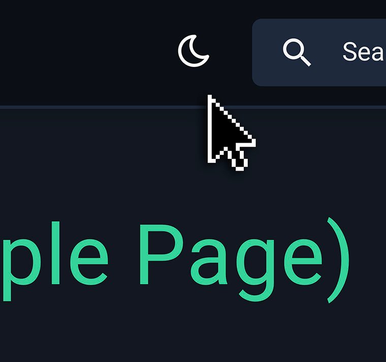
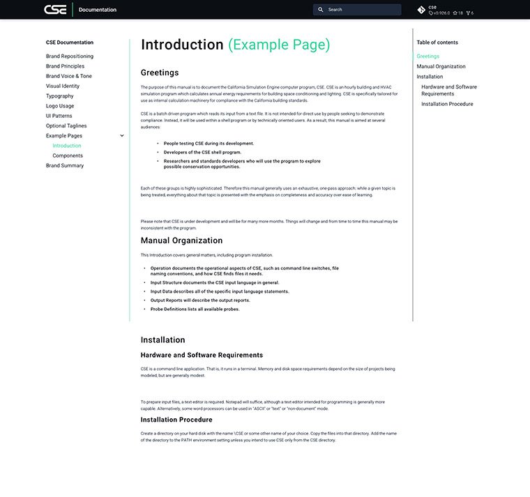
The CSE documentation site began with a dark-first design, partly inspired by energy efficiency. Visually compelling, but users consistently preferred a lighter interface. We introduced a theme toggle before eventually moving to a light-first design. Sometimes the hardest design decision is letting go of one you love.
The lesson
Be committed to solving the problem, not protecting the solution.
Simplicity isn't the absence
of complexity.
The most interesting design problems rarely offer a clean choice between simple and complex. Expert users need depth, newcomers need a way in, engineers need confidence in the data, and teams need something they can build and maintain. Those needs can pull against each other, and a solution that perfectly serves one can create problems for another. My job is to make those tensions visible, understand which ones matter most, and find an experience that respects the people and the system behind it.
What I keep coming back to.
Good UX isn't about imposing a single idea of elegance. It's about asking better questions, making informed trade-offs and staying curious long enough to notice when the obvious answer isn't the right one. Sometimes that means removing steps. Sometimes it means showing more information. Sometimes it means changing the entire direction. The consistent thread is not a particular visual style or process, but a willingness to understand the problem before deciding what simplicity should look like.
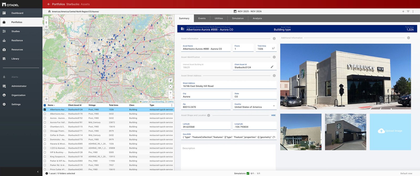
Maps, building information, imagery and technical data brought together in one workspace. The challenge wasn't removing complexity, but organizing it so engineers could understand the relationships and make informed decisions.
The lesson
Make complexity understandable.Never mistake understanding for oversimplification.
Better questions.
Better answers.
The best lessons haven't come from being right the first time. They've come from listening carefully, challenging assumptions and being willing to change my mind. Complex problems don't always need simpler answers. They need better questions.